It is intended. M2HB stays in the same cathegory with DShK (0.50 cal HMG). Before it has had same icon with 7.62/7.94/0.30 HMGs, which is bad, since performance of M2HB is much closer to DShK. Now it helps to clearly see, which HMG you deal with (0.50 or default 0.30).
This is understandable, though wouldn't it be better if all units had an unique unit icon? This would solve both the issue you're suggesting, and also the one NorthWeapon is speaking about.
There are a few units that have similar/the same unit icon... for many this doesn't actually matter, as they're units used by different factions, but for team weapons (and even vehicles) this can be an issue, if either you or your opponent capture these weapons, you might be looking at two identical icons, but two different units.
MGs are the most obvious offender, MGs have one of two icons: "Normal HMG", or "Heavy HMG" (Redundant acronym, I know).
Mortars also generally share the same/similar Icons, the Pack Howitzer and LeIG being exceptions, though they both are distinct from "true" mortars.
To my knowledge the M57 and 6 pounder share an icon... which sort of makes sense, they have the same model... but the units are totally different. Other AT guns have an unique icon, but it's a silhouette, and so is kinda busy.
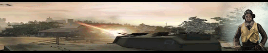
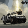
Generally tanks have their own unique icons, but they're very busy, due to being silhouettes of the unit, and can on occasion be a little confusing... it would be quite nice if they had more "abstract" icons, like infantry all do, rather than having silhouettes.
There are one or two other, more minor examples (Pioneers and CEs sharing an icon, possibly others). These don't really matter as much, but it might be nice if they had their own unique ones anyway. I assume, in the case of Pioneers and CEs, that this was done with the idea in mind that "An engineer is an engineer", but the fact the other three factions have unique icons for their engineer units (Despite being functionally pretty similar to Pioneers, in the case of RoyEs) means this has broken down a little.
I might have a look at trying to design some new, more abstract unit icons for some of these units (Though I'm not a fantastic artist, so they'd just be fairly crude proof-of-concept offerings, I'm afraid). Is it something the balance team might have even the slightest interest in, do you think? It would be fairly trivial to implement if the assets are made, and might serve to make some things a bit more readable/professional looking.


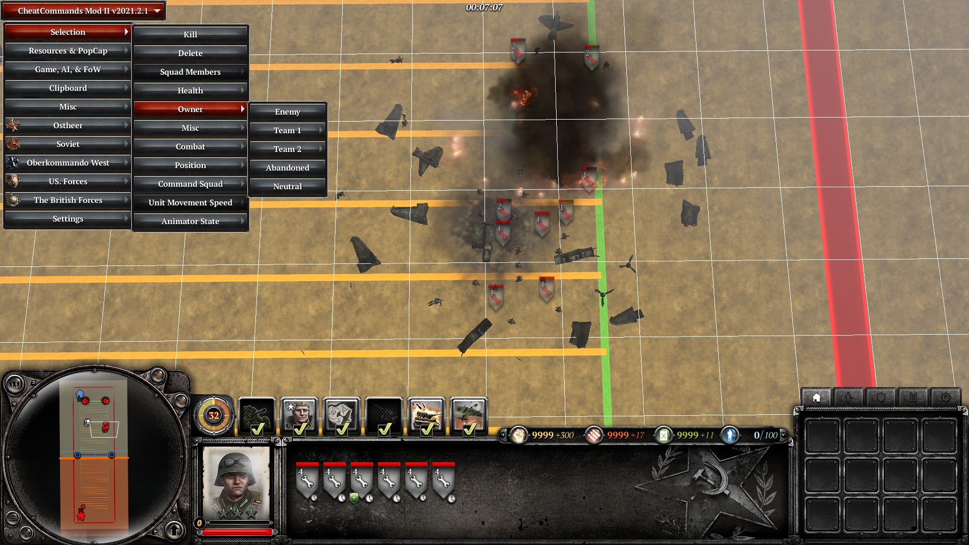
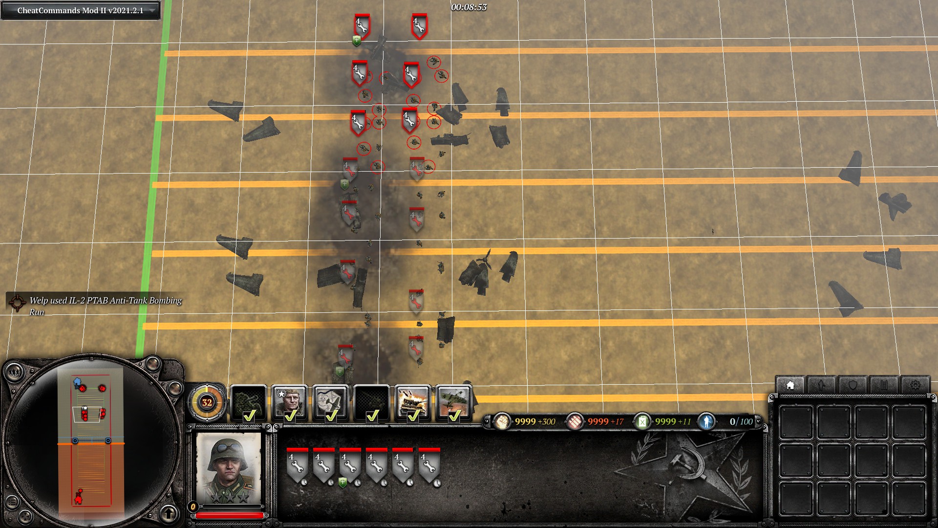
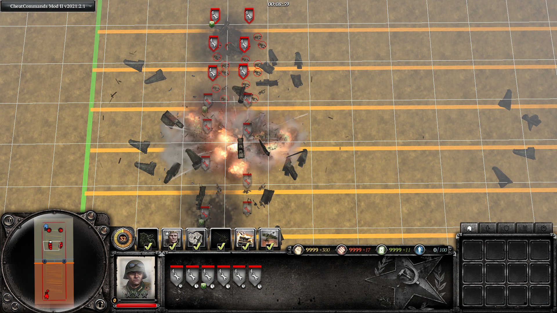
") , but now the icon overlay is shown when unit disables vehicle prioritize which mess things a lot and is counter intuitive to new players (which after some time they understand that those icon represents some different state than normal) and for me cost additional brain CPU to verify if its AT
, but now the icon overlay is shown when unit disables vehicle prioritize which mess things a lot and is counter intuitive to new players (which after some time they understand that those icon represents some different state than normal) and for me cost additional brain CPU to verify if its AT 


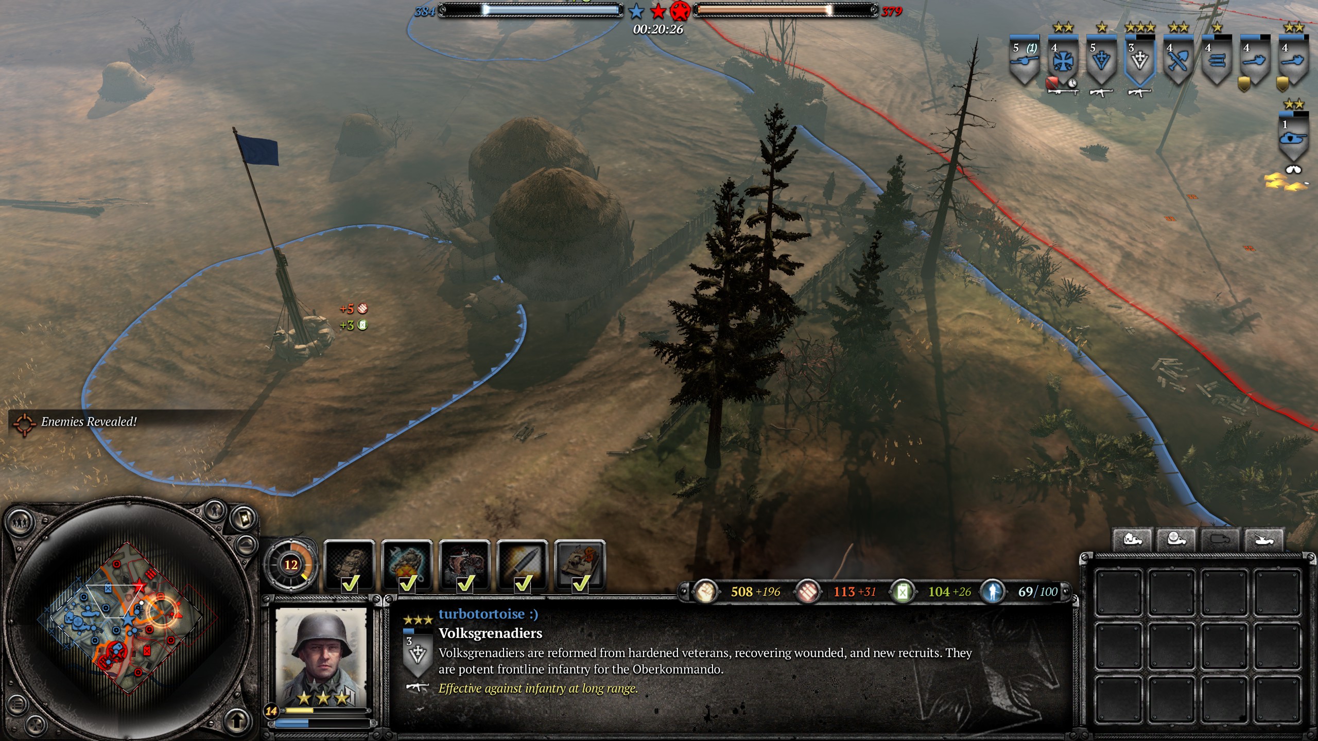
 turbotortoise :)
 IULIUS


 cblanco ★
  Heartless Jäger