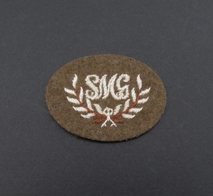
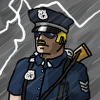
I really don't like how the assault and tank hunter sections have 'smg' and 'at' written in their symbol. Not only this is problematic with localization, but also no other squads are doing it in vanila. Instead they usually have a symbol of the weapon they use (think of assault grenadiers using mp40 or cavalry riflemen using swords ). The old icons were much better imo (at nade and double V) and more readable.
Previously AT section doesn‘t have shieldsymbol at all and was using it from regular IS. These new shieldsymbols are historically accurate,
P.S. Assault grenadiers are bad example, their shieldsymbol is exception, no other shieldsymbol in the game have weapons like that.
P.S.S. If there will be huge number of complains about these symbols, we will create another concept for doctrinal Infantry Section
In today's patch were added UI assets from "Special for patch" section, which i posted recently. Exception was made for:
1. Assault infantry section call-in icon
2. Tank Hunter Section call-in icon
3. UI indicator for passive Ostheer T4 bonus.
4. Some gamefiles fixes for HQ glider, british officer and Thompson upgrade for Assault Section.
This patch was kind of a challenge for balance team, so maybe more will be added with hotfixes.
Waiting for new spotted issues or suggestions for future patches
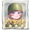
Is the parachute symbol on the assault officer's icon being removed? I see that it is crossed out.
P.S. Assault grenadiers are bad example, their shieldsymbol is exception, no other shieldsymbol in the game have weapons like that.
Technically untrue, aside from the obvious examples like Conscripts and Riflemen, there is a niche example in the case of the Frontoviki from Campaign which use crossed PPSh as opposed to crossed Mosins. That said I have no problem with the current design as it is based in reality.
Technically untrue, aside from the obvious examples like Conscripts and Riflemen, there is a niche example in the case of the Frontoviki from Campaign which use crossed PPSh as opposed to crossed Mosins. That said I have no problem with the current design as it is based in reality.
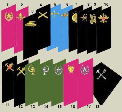
If we talk about the Soviets, their icons are almost completely fictional:
- Engineers must have a standard emblem of engineering troops - two crossed axes.
Conscripts must have the standard emblem of the Rifle Division and the NKVD Rifle Divisions (the same emblem) - two crossed rifles against the background of the target. Because Conscripts are part of the Rifle Division, it does not matter whether they are recruits or veterans.
Penals - well, the very fact that 1% of the total number of soldiers is the main infantry - is ridiculous. But at the same time, we do not see 1% as the main infantry on the other hand (German penal units), hello hypocrisy and stereotypes. Penals had no independent emblems, so the game emblem is a clean field for imagination.
Guard - clearly based on the real Guard emblem, but modified to fit the size of game icons
Shock Troops - had a standard emblem of the Engineering Troops. The game emblem clearly shows the distinguishing feature of the Assault Engineers aka Shock Troops in game.
Paratroopers - were part of the Air Force during World War II, therefore they had the emblem and uniform of the Air Force, or at least use the "Paratrooper" badge which the Paratroopers used as a merit and difference from the Air Force.
Partisans - did not have their own emblem but were part of the NKVD.
I like the new icon for AT IS and Assault IS. Maybe test adding the previous "patch" with smg/At which is also nice logo to their portrait to make UKF portraits more distinct?
I like the new icon for AT IS and Assault IS. Maybe test adding the previous "patch" with smg/At which is also nice logo to their portrait to make UKF portraits more distinct?
AIS already has it's own distinct portraits. But AT section, probably, deserve to be looked at. Thanks for feedback!
...
AIS already has it's own distinct portraits. But AT section, probably, deserve to be looked at. Thanks for feedback!
I have noticed but the portraits and uniforms are not that distinct and the insignia you guys created for the previous patch are nice. Imo adding them to portraits bottom right help identify the type of squad easier.
(I just love how the assault sections are actually medics in tommy uniforms... they got tired of axis forces constantly breaking the geneva convention )
Something irrelevant to the scope of changes this patch, but I've always disliked the icons on the basic sherman and its 76 version, I find myself hovering over them most of the time to make sure Ive got HE/AP/HvAP equipped. Would like more distinct icons tbh
Actually, I believe they are modeled after the 1941(?) Infantry collar tabs
Nope, a star in a wreath is an infantry emblem introduced in 1955 (Order of the USSR Ministry of Defense No. 105 of 06/30/1955). It will be called "rifle troops." Soon the emblem will receive the status of "combined arms emblem", which should be worn by everyone who does not have own emblems of the combat arms.
Something irrelevant to the scope of changes this patch, but I've always disliked the icons on the basic sherman and its 76 version, I find myself hovering over them most of the time to make sure Ive got HE/AP/HvAP equipped. Would like more distinct icons tbh
Idk how to improve these icons right now, because imo they are fine. What about UI indicator on the portrait with picture of current shell in the gun?
Idk how to improve these icons right now, because imo they are fine. What about UI indicator on the portrait with picture of current shell in the gun?
One of the thing I find confusing about the information on switchblade munition is that it does not tell you what it is currently using. Imo the message should something like that:
You are currently using AP round suitable for this... press to switch to HE suitable for this...
Idk how to improve these icons right now, because imo they are fine. What about UI indicator on the portrait with picture of current shell in the gun?
though the icons are quite easy to distinguish side by side they are still very similar and i always found it difficult do discern if i have HE or AP ammo loaded in the heat of the battle... maybe if the explosion effect for the HE shell was a bit more distinctive either in shape or color this would help a bit
Recovery engineers with anvil heavy engineers upgrade should have a separate icon with the recycle symbol in it. Currently they use the same icon as regular heavy engineers, which makes it a bit difficult figuring out which one has smoke.
Recovery engineers with anvil heavy engineers upgrade should have a separate icon with the recycle symbol in it. Currently they use the same icon as regular heavy engineers, which makes it a bit difficult figuring out which one has smoke.
OKW and Ostheer seem to use the same icon for smoke pod when the abilities are different. Think one could remove the "eye" from ostheer ability since it provides less sight.


")


 )
)


 cblanco ★
  보드카 중대
  VonManteuffel
  Heartless Jäger