
Am i playing Warpath or some mobile game?


Posts: 13


Posts: 2238 | Subs: 15
https://steamcommunity.com/sharedfiles/filedetails/?id=2961573188&savesuccess=1
Posts: 2275 | Subs: 1
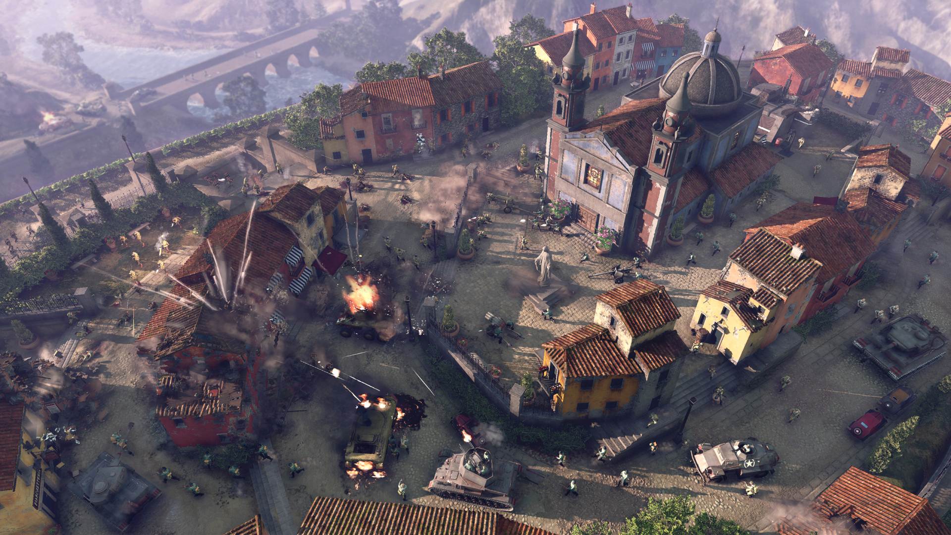
Why CoH3 looks like a bad mobile game? why the game is so cartoonish? Also, interface looks terrible, everything is messed up, all descriptions are microscopic, all effects are way too bright and unrealistic. What happebed?
Name me please a not-cartoonish RTS with good Graphics
Posts: 13
Name me please a not-cartoonish RTS with good Graphics
hmmm, maybe coh1 and coh2?


Posts: 658
Also, interface looks terrible
Agreed. Literally the worst UI I have ever used in any game. Like it is so bad that it makes Dawn of War 3 look like the greatest game ever made.
Posts: 2275 | Subs: 1
hmmm, maybe coh1 and coh2?
what you mean is contrast. They do this because its easier to see and Differ units, Terrain, Buildings etc.
BTW: In Coh1 the Germans had blue (!) uniforms for better visibility on the screen.

Posts: 3145 | Subs: 2
But to be honest CoH3 seems to go back to CoH's graphics rather than pushing them to something as cartoonty as AoE4 from the looks of things.
Altho yeah the campaign did look a bit like Total War: Rome II's campaign or a modern day mobile game one for one reason or another.
We'll see tho, only time will really tell as it's still pre-alpha as others have already stated.

Posts: 112
Graphics are a bit bright and can definitely be muddied up a bit, but it looks goods. Some effects are definitely Alpha but the overall resolution and detail level (grass etc) is definitely beyond COH2.
So so so many people are slating this and AOE4 for mobile graphics, they all need a reality check. Yes they could make it absolutely amazing, but then the only way we would see units wearing CAMOUFLAGE is by the UI icons. Wouldn't be very useful in an RTS would it?
Also remember the colour palette in Italy (a dry med country) will be very different (brighter) to the Western and Eastern fronts.

Posts: 3423 | Subs: 1
Why CoH3 looks like a bad mobile game?
Cause the pre-alpha has been out for less than 5 hours? You can't be serious
Game is over a year away from even being released
Posts: 359
Panzer tactician is no different than a skill shot. Hardly a "Free" get out of jail card.
Posts: 3145 | Subs: 2
how and where do you see cartoons? All I can see is brighter coh1.
If you really zoom in the colors become more saturated and start looking more cartoonish for some reason, at least for me.


Posts: 224
The game looks good. I don't think people even know what "cartoonish" means if this is what that looks like to them.

Posts: 67
I remember this exact same argument from when Company of Heroes 2 was announced and approaching release, people were complaining that it was "too cartoonish" compared to the first game which had comic-book broad lines on every character and most environment objects, and Hollywood SFX-style particles.
The game looks good. I don't think people even know what "cartoonish" means if this is what that looks like to them.
I don`t think it looks "cartoonish" but it does feel to me like the tones are too ``colorful`` when compared to the muted tones/colours Coh2 had, if that makes any sense.

Posts: 2184 | Subs: 2
Posts: 224
I don`t think it looks "cartoonish" but it does feel to me like the tones are too ``colorful`` when compared to the muted tones/colours Coh2 had, if that makes any sense.
Look at pictures of the Mediterranean and its environs, I think they pretty much nailed the aesthetic so far.
Livestreams
 |
|
|
12 | ||
 |
|
|
1120 | ||
 |
|
|
1 | ||
|
|
|
|
1 |
Ladders Top 10


-
#Steam AliasWL%Streak
- 1.48570.874+9
- 2.817140.854-1
- 3.1140404.738+12
- 4.564352.616+11
- 5.23359.798+10
- 6.14869.682+1
- 7.451228.664+2
- 8.1406775.645+2
- 9.11930.799+6
- 10.348124.737+2
Replay highlight
-
 cblanco ★
 -
 보드카 중대
-
 VonManteuffel
 -
 Heartless Jäger

Board Info
3 posts in the last week
20 posts in the last month
Welcome our newest member, bajicasino1
Most online: 4501 users on 26 Oct 2025, 01:00 AM