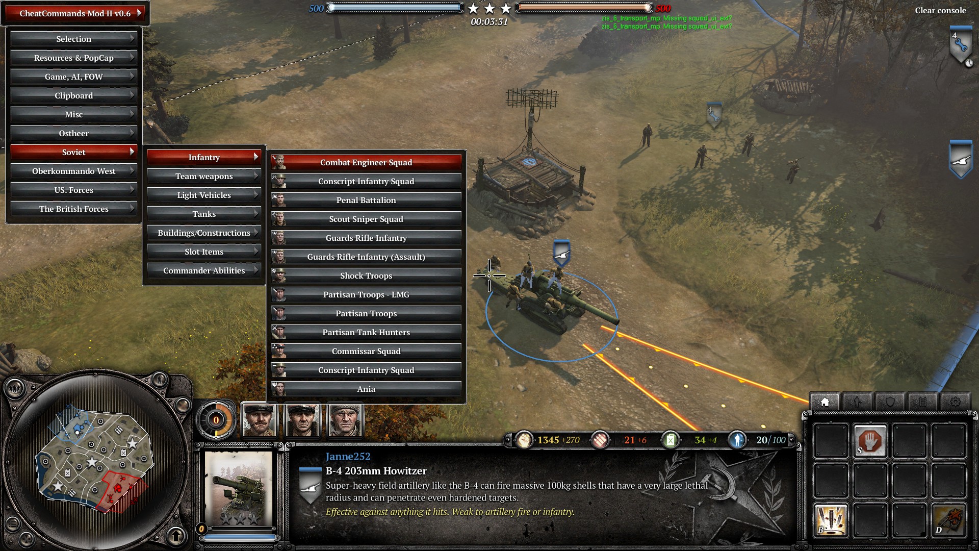
Hey Janne. I have a suggestion for the interface. The only problem I have with v2 over v1 is that the menus take up the whole screen pretty much when you are deep in a menu. Have you made any attempts to make the menu structure smaller? either making the text for each item shorter, or perhaps there is a way to have slightly overlapping menu branches if you left-justify the text?
An alternative solution would be an option to just change to colour coded menu items and when you are in one menu you can easily access the outer branch items by a colour-coded or icon-coded index? This all sounds very complicated, but just thought I'd suggest it anyway.
The interface is designed for the standard 1920x1080 resolution. The goal is to make it as easy to understand as possible - thus the long, descriptive button titles. The menu does take a lot of space indeed but only when you are doing something. Also all the actions that require the crosshair for "aiming" are designed not to take more than half of the screen space.


 Finland


 -HOI-Chyle@Zaitsev
 VonIvan


 cblanco ★