

Posts: 1820 | Subs: 2


Posts: 658


Posts: 1116 | Subs: 1

Posts: 3120 | Subs: 2
Posts: 658
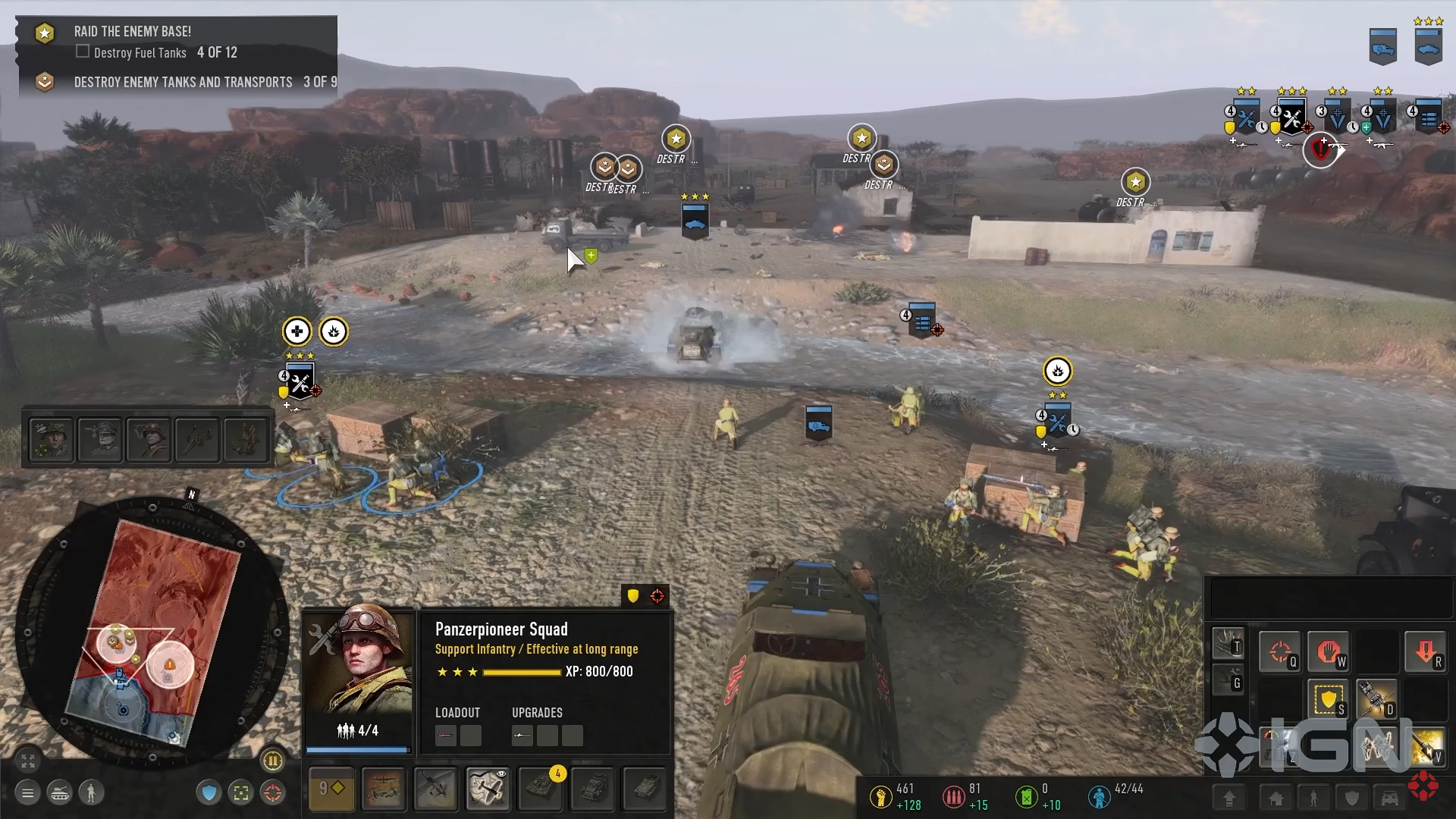
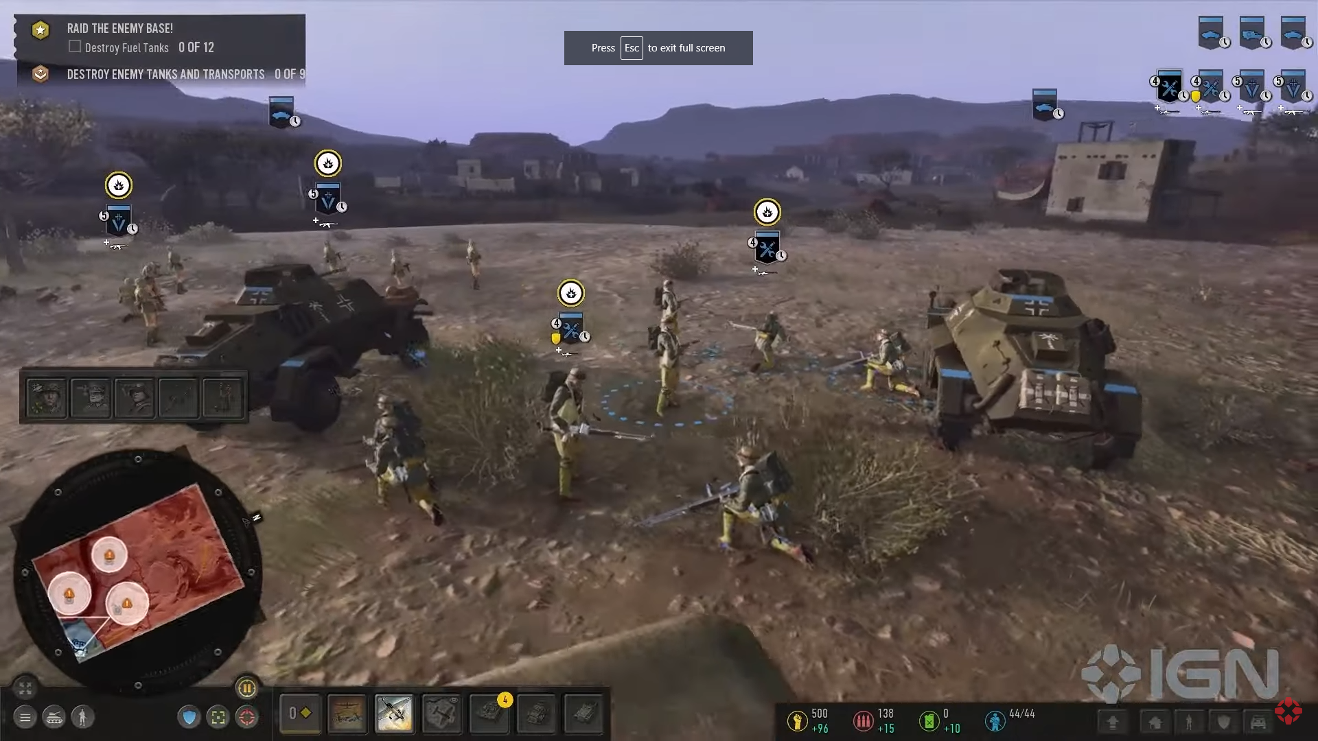
I just dont get it, what with this desire to put this unit box everywhere but not in the place where it should be.
Why should be near the mini map and not on the right side where you literary have an empty space which is not used.
There was like dozens of concepts made by the community which looks x10 times better then this.
 2
2 
Posts: 538

Posts: 2169 | Subs: 2


Posts: 823 | Subs: 3
Still complete assThis

Posts: 3050 | Subs: 3
Posts: 658
I think if the unit card gets moved to the right, above the resource counter, then it's okay

Posts: 356

Posts: 240
") The Ruleset is only a guideline, and are not actually the Rules. This is .org
The Ruleset is only a guideline, and are not actually the Rules. This is .org
Posts: 1820 | Subs: 2
2 Posts: 538
I have not played or even looked at any of Coh3, for obvious reasons.
- I would move Call-ins(1) and Commander(3) above stats (2). Another option would be make Call-Ins vertical and move them to the left of the minimap.
- Units in upper right(4) need flipped. You will always have way more infantry then vehicles, so Inf should be on top of the screen out of your view. I also liked these being at the bottom near the minimap so you can select, see, and move units all within a small area. But I think that was an option correct?
- The selection detail pane (3) should be resized. The Portrait can remain the same size but the details should be about 60% of that height. And the upper right buttons should be on the left side. This would create an easy to see thru portal to the center of the screen.
Since I did not play it, I could be completely wrong of course
Posts: 3050 | Subs: 3
If Relic wanted to impress me, they would create a moddable UI API kind of like World of Warcraft or similar games in which you can mod/change the UI (even Dota 2 has this even if its somewhat limited)
I would rather they copy the UI from COH 1 or COH 2 and just abandon whatever the hell this trash is that they are trying to make that isn't working.

Posts: 1198
Posts: 823 | Subs: 3
Idk man, I'd say we should at least try and give it a shot for a couple weeks and then determine how good or bad it is.
I still remember very well: When I started playing CoH2 in 2013 after 4 years of CoH1, I absolutely disliked the new UI and was like "omg this looks so shit, CoH1 UI is much better" but after a couple weeks I loved it
Posts: 3050 | Subs: 3
I loved CoH2 new UI instantly. Maybe you are weirdo. CoH1 UI was so shit even for 2006 standards
Posts: 823 | Subs: 3
>:-D Fite me !
hmm
Posts: 823 | Subs: 3
 |
|
|
36 |
 cblanco ★
  보드카 중대
  VonManteuffel
  Heartless Jäger


