Login

russian armor

CoH2.org Redesign Concept

15 Jul 2015, 10:22 AM
#1
avatar of Highfiveeeee

Posts: 1740

Hey guys!

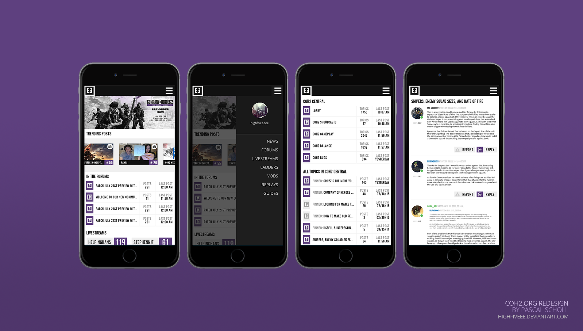
I was pretty bored (at work :snfPeter: ) so I decided to create a concept of a new CoH2.org look.


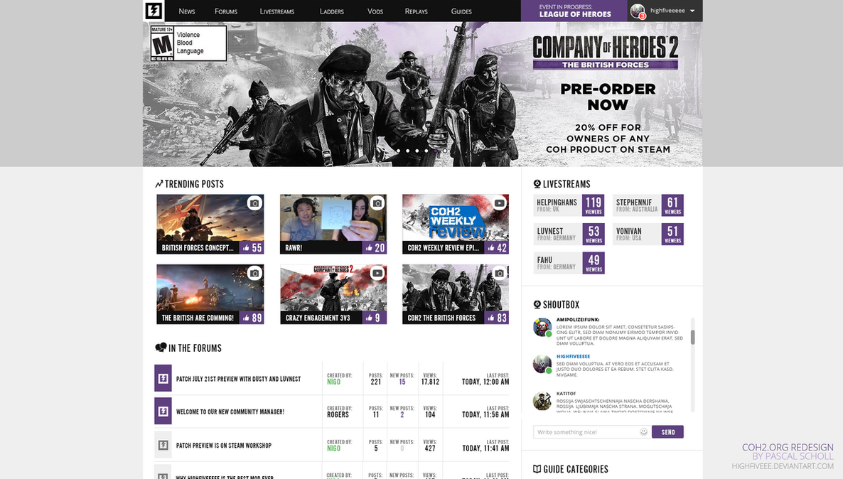
Or look it up on DeviantArt:
http://highfiveee.deviantart.com/art/CoH2-org-REDESIGN-concept-546504819?ga_submit_new=10%253A1436955522

Tell me what you think!

Much love, peace and everything
Highfiveeeee
15 Jul 2015, 12:14 PM
#2
avatar of Mithiriath
Director of Social Media Badge

Posts: 830 | Subs: 3

Looks awesome. :thumb:

A nav bar stick to the top if the user scrolls down would be great.
15 Jul 2015, 12:25 PM
#3
avatar of l4hti

Posts: 476

Great work. I like your shoutbox. Specially katitof MVGame
15 Jul 2015, 12:25 PM
#4
avatar of Kobunite
Patrion 15

Posts: 615

:-O

Looking good HighFiveeeee!
15 Jul 2015, 12:27 PM
#5
avatar of nigo
Senior Editor Badge

Posts: 2238 | Subs: 15

15 Jul 2015, 12:40 PM
#6
avatar of Fanatic
Patrion 14

Posts: 480 | Subs: 1

Looks awesome, i do like it. I bit too much purple from my point of view, but thats a matter of taste i guess. :)

So when is the live start? :-P

15 Jul 2015, 13:21 PM
#7
avatar of luvnest
Strategist Badge
Patrion 39

Posts: 1094 | Subs: 20

That indeed looks awesome!
15 Jul 2015, 15:06 PM
#8
avatar of nigo
Senior Editor Badge

Posts: 2238 | Subs: 15

Ami, Janne, Seb....


MAKE IT HAPPEN :D
15 Jul 2015, 15:10 PM
#9
avatar of SwonVIP
Donator 11

Posts: 640

Kreygasm
Looks awesome... great job!
15 Jul 2015, 19:38 PM
#10
avatar of Snipester
Patrion 39

Posts: 102

Is there a place I can offer to contribute if they do something like this? I've had about 3 or so years of web dev experience using MVC ASP.NET/HTML/CSS/JS.
15 Jul 2015, 19:46 PM
#11
avatar of Theodosios
Admin Red  Badge

Posts: 1554 | Subs: 7

3rd September could be the date at which CoH2 and COH2.ORG get a redesign. :snfPeter:

Looks handsome!
15 Jul 2015, 19:50 PM
#12
avatar of HighFive
Donator 22

Posts: 66

Very nice layout it's crisp, clear and well designed. Well done.
15 Jul 2015, 20:51 PM
#13
avatar of VonIvan

Posts: 2487 | Subs: 21

Fuck yeah someone incorporate this immediately. :snfPeter:
16 Jul 2015, 01:49 AM
#14
avatar of Basilone

Posts: 1944 | Subs: 2

I like the pictures by the shoutbox, the trending, and the top redesign. But I find the forum stuff unnecessary and I dont like only showing the top 5 streams, since that only further promotes bandwagon viewing the same people. Sometimes Rogers myself and a few other longtime community members are streaming some other games and our old regular viewers drop by because they noticed us on the home page.
16 Jul 2015, 05:17 AM
#15
avatar of pigsoup
Patrion 14

Posts: 4301 | Subs: 2

i personally dont like it. i am not big for the trending 'slick' designs that remove borders unnecessarily
20 Jul 2015, 10:51 AM
#16
avatar of Highfiveeeee

Posts: 1740

Based on the redesign concept I wondered how a mobile page / webapp for CoH2.org could look like:


Or check it out on deviantart:
http://highfiveee.deviantart.com/art/CoH2-org-MOBILE-DESIGN-concept-547633992?ga_submit_new=10%253A1437389297
20 Jul 2015, 11:02 AM
#17
avatar of Jackas4life
Benefactor 115

Posts: 486 | Subs: 1

I'm not sure how much work it would take, but I'd love to see the redesign become a reality as well as an actually app for IOS and android for the near future.
20 Jul 2015, 11:15 AM
#18
avatar of wuff

Posts: 1534 | Subs: 1

I like it, here is some ideas.

Capitalize the menu headers


Live streams
Use a listview
Use flags not text
Include provider icons (twitch, hitbox, youtube gaming)
Seb
20 Jul 2015, 11:28 AM
#19
avatar of Seb
Admin Black Badge

Posts: 3709 | Subs: 2

If the content to display is the same you can theoretically create the theme by just applying a custom css (and maybe some js) on top of the existing site code. All in client side. There are tons of firefox/chrome extensions to do that.

And if you really want to make a mobile/responsive site, it would be much better to fit for all of different resolutions (flexible width), not just having one small and one big format.

The mobile version is very important and is kinda a fail on our part to not have done it (we created the site just before or at the start of the mobile evolution when it wasn't so dominant). If you wanna go that way we can definitely provide support where needed.

However we still have a lot of reasons of why things have been done one way or another. A good example being the full livestream list as mentioned above. Another is that you forgot the ads space, this is unfortunately very important. Pretty much every text, box, element and their positions have been thought about during hours on our part and usually answer to a need or a will. This is not just about looking good, it's before anything about presenting date the way we want it. For those reasons I'm very mixed about a redesign, or even against it (unless we spend months again to rethink about it, time we don't have). But making it responsive is definitely only a good thing.
1 user is browsing this thread: 1 guest

Ladders Top 10

  • #
    Steam Alias
    W
    L
    %
    Streak
Data provided by Relic Relic Entertainment

Replay highlight

VS
  • U.S. Forces flag cblanco ★
  • The British Forces flag 보드카 중대
  • Oberkommando West flag VonManteuffel
  • Ostheer flag Heartless Jäger
uploaded by XXxxHeartlessxxXX

Board Info

481 users are online: 481 guests
9 posts in the last 24h
39 posts in the last week
151 posts in the last month
Registered members: 45060
Welcome our newest member, Lcfvfeeaka
Most online: 2043 users on 29 Oct 2023, 01:04 AM