Login

russian armor

2-4 Darmok and Jalad

5 Jun 2014, 23:16 PM
#1
avatar of Srinidhalaya

Posts: 357

Darmok and Jalad

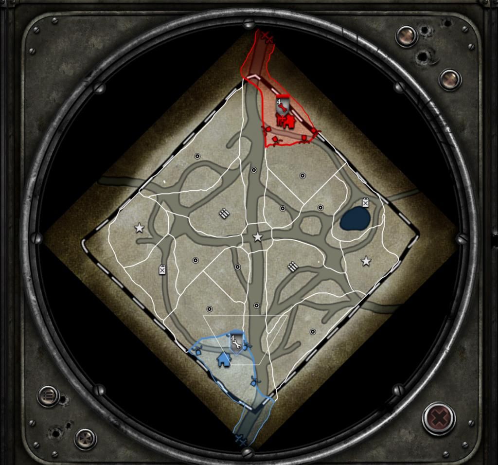
Darmok and Jalad at Tanagra, when the walls fell.


Work in progress, feel free to leave feedback. Thanks for your time!
5 Jun 2014, 23:52 PM
#2
avatar of DanielD

Posts: 783 | Subs: 3

Nice map name. Don't like how one muni is up against the edge of the map while the other is closer to the middle, I think usually symmetry is good with territory layouts.
5 Jun 2014, 23:57 PM
#3
avatar of Srinidhalaya

Posts: 357

I avoided symmetry at all costs, but they are equal distance from the cut off sectors. I forgot to upload the sector screen. I find it plays out well, but I'm not that good either. That being said, nothing is concrete, and can be changed if it turns out to be needed. :)
6 Jun 2014, 15:11 PM
#4
avatar of DrunkinGambit

Posts: 150

Looks incredibly dark. Lighten the atmosphere up a bit. I agree with DanielD... You need to tweak that north Muni point. I fully understand fighting symmetry, but what you're missing is not the distance from cut-off sectors, but distance to the base. The north Muni point looks considerably closer to the base and is much more tucked away. There has to be something in the favor of the south to counteract this. Otherwise you are forfeiting balance, which really is the priority. Balance at all costs, not asymmetry.
6 Jun 2014, 17:00 PM
#5
avatar of Srinidhalaya

Posts: 357

Easy enough to change, I'm surprised no one said anything in my thread "sector feedback". My logic was, the muni close to the base, is on the outside of the map, taking units away from the middle. Conversely, the muni towards the center is closer to the front, harder to defend, but it allows to keep more of your forces towards the center. As I said earlier, I'm not the best player, but I actually had more difficulty playing on the side where the muni is closer to the base, because it required spreading my forces out more. Either way, this is great feedback, and I will most certainly change it up, to see how it works out.

Will also add some more light, it was a preset, that has cloud shadows traveling on the terrain, and sometimes its darker than others, as clouds pass over. It's hard to adjust light on my end, as I have a BenQ 120hz monitor that has some quick change buttons to adjust lighting, that brightens up the screen and what not, so I'm never really sure how it looks on other peoples computers.

Once again, huge thanks for the feedback, exactly what I was looking for!
7 Jun 2014, 01:54 AM
#6
avatar of Srinidhalaya

Posts: 357

So I increased the light intensity, and yes, much better! Regarding the muni points, would moving both to the edge of the map, or to the center of the map, be more desirable?

Ohh, and did you recognize where the name came from? :P
8 Jun 2014, 03:58 AM
#7
1 user is browsing this thread: 1 guest

Ladders Top 10

  • #
    Steam Alias
    W
    L
    %
    Streak
Data provided by Relic Relic Entertainment

Replay highlight

VS
  • U.S. Forces flag cblanco ★
  • The British Forces flag 보드카 중대
  • Oberkommando West flag VonManteuffel
  • Ostheer flag Heartless Jäger
uploaded by XXxxHeartlessxxXX

Board Info

494 users are online: 1 member and 493 guests
aerafield
19 posts in the last 24h
50 posts in the last week
105 posts in the last month
Registered members: 44659
Welcome our newest member, Yourcounselling
Most online: 2043 users on 29 Oct 2023, 01:04 AM