I agree with both Ami and Inverse on both the points they mentioned:
When I first had a chance to play it, watching the resources took me a couple of tries. Also, the colors chosen this time around are NOT a good idea for resources. I am partially colorblind to Green and Red, and it was a pain trying to discern between Munitions and Fuel Income. Sure, not everyone suffers from this, but a significant portion does. Make them vertical again Relic!
As for the "bridge", it is completely useless as of now in my opinion. That description is exactly the same as the description given by the tooltips when trying to build the unit. If players REALLY need to read carefully into what each unit does, and their historical background, include an encyclopedia, as a couple of RTS have done so in the past (including the AoE and SC series).
If you can't figure what to put in this bridge, such as general strengths and weaknesses of the unit , then remove the bridge altogether, it gives us more viewing space.
First look: Company of Heroes 2 in-game UI
4 Jan 2013, 23:08 PM
#22


Posts: 642
5 Jan 2013, 00:12 AM
#23

Posts: 48
Dunno why a sentence describing the unit (that you will probably only read once) has to run across the entire width of the middle UI box. I'd much rather have it boxed in, with some kind of blank box remaining (like in COH) where a streamer could put their webcam or a sponsor overlay. It will look bad if overlays will have to crop these sentences in half.
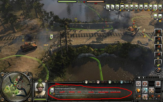
Total waste of space indeed. After a few games who needs an units tutorial ? And still it takes the most important place in UI, wtf ?! COH camera is already very close to the ground, everyone has accepted that as a part of the gameplay, but keep diminushing game's readability with X-large UI is just dumb.
I'm glad they apparently decided to makes units's icons permanently displayed (main flaw in COH1 UI if you ask me) ---> they should be in place of the worthless unit description.
5 Jan 2013, 02:29 AM
#24

Posts: 838
I like what I see for the most part! ")

5 Jan 2013, 03:03 AM
#25

Posts: 31
Assuming yellow still means allies, the Russian's ally might be Wehrmacht (look at the allied squad on the bridge, it uses the Grenediers's icon, although it could be a placeholder)
Something else, the silhouette of units don't show when their behind terrain, gonna be a pain in some maps
Something else, the silhouette of units don't show when their behind terrain, gonna be a pain in some maps
5 Jan 2013, 03:21 AM
#26
Posts: 5
+1
I posted this link also on the main companyofheroes forum as well. I totally agree with the colors. I am colorblind to RED/GREEN combination. It's actually quite common in males up to 10% of the population. However with RED/BLUE, practically no one has this problem! Why alienate up to 10% of the player base? Just go back to the COH1 colors RED/BLUE. Please Relic!
Here are the stats on color deficiency.
http://www.colour-blindness.com/general/prevalence/
+1
I am also red/green color blind, and have issues with some other colors and shades. I really hope this is something Relic addresses. I can't even enjoy playing some games that don't have a high contrast difference. Really frustrating to click on the green thing, then find out it was the red thing.
5 Jan 2013, 04:47 AM
#27


Posts: 934
The map UI was my major issue with this game but I never had the chance to express my opinion on it.
The mini-map is incredibly small with respect to what is going on I find. There is a large amount of wasted space around the outside, but they may be due to how created units spawn.
Even the tac-map though though the unit symbols were so small that you can't tell without strain what is what. The CoH1 tac-map is so clear and simple I can't see any reason to changing it.
Good game though, cant wait til beta comes
5 Jan 2013, 06:58 AM
#28

Posts: 522
I agree with much that has been said so far, the UI needs quite a few changes, my main issue atm is the resources layout and the fact that the unit description takes up too much space.
5 Jan 2013, 14:07 PM
#29

Posts: 78
I agree with everything that's been said here
5 Jan 2013, 14:47 PM
#30
Posts: 2807 | Subs: 6
[Trollic]lookWest is such a bad Troll there
5 Jan 2013, 22:52 PM
#31
Posts: 10
#24 - maybe they have a bigger plan with this german vs german match up. what i mean is they will " force" us to accept the unhistorical game feature so they can put in the coh1 USA or brits in later expansions? worst case senario 3v3 whermacht,soviet,brit vs usa usa usa... a cheap fast way if your company is low in budget.
5 Jan 2013, 23:27 PM
#32
Posts: 1620 | Subs: 2
#24 - maybe they have a bigger plan with this german vs german match up. what i mean is they will " force" us to accept the unhistorical game feature so they can put in the coh1 USA or brits in later expansions? worst case senario 3v3 whermacht,soviet,brit vs usa usa usa... a cheap fast way if your company is low in budget.
What?

Signature by Ginnungagap
6 Jan 2013, 01:33 AM
#33
Posts: 31
#24 - maybe they have a bigger plan with this german vs german match up. what i mean is they will " force" us to accept the unhistorical game feature so they can put in the coh1 USA or brits in later expansions? worst case senario 3v3 whermacht,soviet,brit vs usa usa usa... a cheap fast way if your company is low in budget.
What?
--
I also can't find anything vaguely temperature-shaped. Or maybe that's because it's a summer map. But I can't find any temperature gauge here: http://www.coh2.org/topic/773/don-t-miss-the-coh2-surprise/post/9657 .
6 Jan 2013, 05:30 AM
#34
Posts: 1620 | Subs: 2
I don't think the maps have any global temperature. Units in cold places get colder, units in cover/around fires/in buildings/not in cold places don't get colder (and around fires they also warm up). Wondering where the temperature gauge is is like wondering where the cover gauge is. Cover is just a property of certain areas of the map, and freezing temperatures are a property of certain areas of the map.
Signature by Ginnungagap
Only Relic post 6 Jan 2013, 06:44 AM
#35

Posts: 160 | Subs: 3
The image Third linked is from a non-cold... cold map (if that makes sense). It was a demo map that we built to show off snow, ice, etc before we had the ColdTech feature implemented. Snow maps are cold, non-snow maps are not. The thermometer appears on the unit's portrait and beside their decorator.
6 Jan 2013, 15:13 PM
#36
Posts: 10
Sorry for my bad english, what i mean is they will use older faction again, like in the new german faction. all i see is a PE - whermacht meltet faction. beacause they have the units from coh1.
ive heard that it is possible to fight german against german in coh2. and if so. why not soviet against Brits or USA in a later expasion ?
ive heard that it is possible to fight german against german in coh2. and if so. why not soviet against Brits or USA in a later expasion ?
6 Jan 2013, 16:45 PM
#37
Posts: 1620 | Subs: 2
Well, yeah, sure. Just like Men of War.
Signature by Ginnungagap
7 Jan 2013, 18:26 PM
#38


Posts: 123
Im thinking it will be agood game but not company of heroes anymore =( i dont like changes
Waiting for Company of Heroes 3


7 Jan 2013, 18:39 PM
#39
 5
5 Posts: 16697 | Subs: 12
CoH was nearly perfect in so many ways. It's major failures were marketing, balance and patch support. The core mechanics, particularly in the vanilla match-up, were a thing of beauty. The saying, "if it ain't broke, don't fix it" could go a long way here.
With Cold Tech, True Sight, an entirely new Eastern Front campaign, and two new armies, you have enough for a full sequel. The other major improvements we needed were an observer mode, better matchmaking, better anti-cheat, better lobby/chat options, a better way to share maps ingame, and better customization (hotkeys, etc).
What we didn't need was a major resource overhaul, a popcap change, and major UI changes. The resource mechanic is of utmost importance, and I'm still waiting to see what the final solution will be. I'm still waiting to hear a reason for why it was messed with in the first place, as there was absolutely nothing wrong with how it was. The UI needs to be less cluttered and more stream-friendly, and above all else, it needs to follow function over form.

7 Jan 2013, 18:44 PM
#40
Posts: 1620 | Subs: 2
I agree 100% but on the other hand even a super cluttered UI isn't too bad once you learn it. This doesn't look as clean, elegant, simple, or even as useful as CoH's UI. Maybe once we try it out in the beta our opinions will change though.
It seems like Relic is changing stuff mostly just for the sake of changing stuff (going from red and blue, which looked great, to red and green, which screws over colorblind people, or moving the resources for some reason, or making the unit portrait area more complex while subtracting information).
It seems like Relic is changing stuff mostly just for the sake of changing stuff (going from red and blue, which looked great, to red and green, which screws over colorblind people, or moving the resources for some reason, or making the unit portrait area more complex while subtracting information).
Signature by Ginnungagap
7 Jan 2013, 18:50 PM
#41
5 Posts: 16697 | Subs: 12
It seems like Relic is changing stuff mostly just for the sake of changing stuff (going from red and blue, which looked great, to red and green, which screws over colorblind people, or moving the resources for some reason, or making the unit portrait area more complex while subtracting information).'
Agreed. I would prefer reversions to the COH1 scheme on all 3 counts, particularly the first two:
- Red and Blue was win and has become iconic for Company of Heroes, why fuck with it?
- The resources need to be quickly scan-able for the eye (function over form). Having them next to the mini map, displayed vertically, put them in a location that already gets constant "looks" while playing. Moving them away from there and making them smaller is just a terrible idea, and should be reverted.
1 user is browsing this thread:
1 guest


Ladders Top 10


-
#Steam AliasWL%Streak
- 1.48570.874+9
- 2.817140.854-1
- 3.1140404.738+12
- 4.564352.616+11
- 5.23359.798+10
- 6.1401767.646-4
- 7.450228.664+1
- 8.11930.799+6
- 9.348124.737+2
- 10.430306.584-1
Data provided by
 Relic Entertainment
Replay highlight
VS
-
 cblanco ★
 -
 보드카 중대
-
 VonManteuffel
 -
 Heartless Jäger

Einhoven Country


Honor it
18
Download
3333