Login

russian armor

Outdated Main Menu interface in CoH 2

Do you support this idea?
Option Distribution Votes
67%
26%
7%
Total votes: 27
Vote VOTE! Vote ABSTAIN
28 Mar 2016, 17:51 PM
#1
avatar of Osinyagov
Senior Modmaker Badge

Posts: 1389 | Subs: 1

Since release of CoH 2 passed 3 years (end of 2013-2016). Many things were changed, many things was added. But some things still in 2013. I am talking about main menu in game. I will try to explain without images (i can't download them here and i don't know why):

alliesallies Current Main Menu alliesallies

What can you do from main menu in CoH 2:
1. Enter singleplayer. Ok
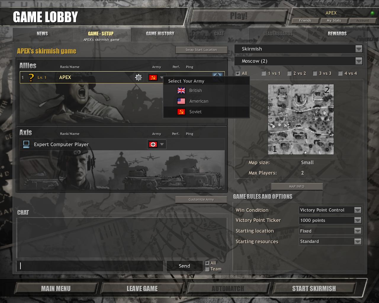
2. Enter Multiplayer. Here is problem. You open new page with 4 buttons with screens from Alpha CoH 2, and difference between this buttons in what type of match will be set by default in your lobby (Versus Players, versus AI, Custom Game). You can choose it in lobby. No need to make separate menu before opening of lobby.
It's enough space in main menu for 1 additional button (Server browser)
3. Enter Theater of War.
4. Enter Live games. Ok
5. Watch Replays. Ok
6. Tutorials. Ok
7. Addition Content. Ok
8. Exit to Windows. Ok

Also, you have additional small menu in bootom-left corner. I think it should be integrated in the Main Menu.
1. Showcase. Unnecessary. You have steam achievments for this.
2. Options. Why they are not in the main menu?
3. Match stats. It's the only unique button here. I don't know what to do with it. Maybe add it to the lobby?
4. Leaderboardes. Can be added to main menu, also you can look it from the lobby.
5. Customer Service. Can be added to main menu.
6. Credits. Can be added to main menu.
7. Exit to Windows. Duplicate.
8. Enter global chat. Never see somebody talking here. We are here for fight, not for talking. Also, you have many other ways to communicate with people and find teammates (like coh2.org :) )

What i want to say as conclusion? CoH 2 need menu redesign. Player should have no problems to do everything he needs from main menu.

alliesallies How main menu should looks like alliesallies

1. Singleplayer:
1.1 USSR Campaign
1.2 USA Campaign
1.3 Theater of War

2. Multiplayer:
2.1 Open Lobby
2.2 Open Server Browser
Edit. I think multiplayer section from vCoH is the best solutin here. With it's upper menu you see everything you need from multiplayer in game.


3. Learn.
3.1 Live Games
3.2 Replays
3.3 Tutorials

4. Additional Content
4.1 In Game Store
4.2 Modding Hub

5. Other
5.1. Options
5.2 Customer Service
5.3 Credits
5.4 Exit to Windows

Thank you for attention!
28 Mar 2016, 18:08 PM
#2
avatar of TheSleep3r

Posts: 670


1.3 Theater of War (Update units profiles to actual from MP)

i think you have absolutely no idea what you are trying to do here

the only things i'd like from the main menu is it beign fast, and get rid of soviet symbol upon quitting the game
28 Mar 2016, 18:20 PM
#3
avatar of Osinyagov
Senior Modmaker Badge

Posts: 1389 | Subs: 1


i think you have absolutely no idea what you are trying to do here

the only things i'd like from the main menu is it beign fast, and get rid of soviet symbol upon quitting the game


I am trying to make main menu more comfortable, usefull, integral and fast. You will be much faster, if you can do everything from main menu. Without any unnecessary undermenus (like current undermenu for multiplayer)
I agree, that game need redesign of interface (this game now not only about Eastern Front and especially USSR), but this thread not about it.
28 Mar 2016, 20:09 PM
#4
avatar of Vuther
Senior Moderator Badge

Posts: 3103 | Subs: 1


1.1 USSR Campaign (Update units profiles to actual from MP)
1.3 Theater of War (Update units profiles to actual from MP)

They totally ain't gonna do that. It's definitely quite intentional for them to be separate, for one.
29 Mar 2016, 17:05 PM
#5
avatar of Osinyagov
Senior Modmaker Badge

Posts: 1389 | Subs: 1

Update first post, delete some offtopic information (like update units from campaign and ToW to current from MP).
29 Mar 2016, 17:11 PM
#6
avatar of Fanatic
Patrion 14

Posts: 480 | Subs: 1

I agree with the general idea, the main menu is a typical grown structure who requires a fundamental rethink.
31 Mar 2016, 09:35 AM
#7
avatar of wuff

Posts: 1534 | Subs: 1

The GUI has always been a clunky, old fashioned mess. Sadly I doubt it will change.
31 Mar 2016, 10:13 AM
#8
avatar of ferwiner
Donator 11

Posts: 2885

I dont think there is any need for layout changes. Every time you open the game you click exactly 3 times: multiplayer, automatch, search. Its not too much even if it can be shortened to 2. Not really worth devs time to work on it. What they could work on is menu performance, the decrease of time you need to start searching would be much greater that way.
31 Mar 2016, 11:52 AM
#9
avatar of Osinyagov
Senior Modmaker Badge

Posts: 1389 | Subs: 1

I dont think there is any need for layout changes. Every time you open the game you click exactly 3 times: multiplayer, automatch, search. Its not too much even if it can be shortened to 2. Not really worth devs time to work on it. What they could work on is menu performance, the decrease of time you need to start searching would be much greater that way.


Not to 2, but to 1. In my concept, you need just to launch game and after that click "Lobby". As i said before, player should do everything he want from main menu, without any other undermenus. And this will "decrease of time you need to start searching". :)
P.S. Buttons in my concept groupted like in current menu (play, learn, additional content and exit to windows), but give more options to player.
31 Mar 2016, 12:27 PM
#10
avatar of Uzmanoy

Posts: 106

How to use menus;

1-Multiplayer
2-Automatch
3-Search
4-ALT + F4 F4 F4 F4 :hansRAGE:

Thats all you need :thumbsup:
31 Mar 2016, 20:22 PM
#11
avatar of ferwiner
Donator 11

Posts: 2885


Not to 2, but to 1. In my concept, you need just to launch game and after that click "Lobby". As i said before, player should do everything he want from main menu, without any other undermenus. And this will "decrease of time you need to start searching". :)
P.S. Buttons in my concept groupted like in current menu (play, learn, additional content and exit to windows), but give more options to player.


So you want the to automatically star search once you click the automatch button? This won't be a welcomed change IMO.

Otherwise it is still 2 clicks just like I counted. Also mind that currently the automatch button in multiplayer submenu is exactly where the multiplayer button is in main menu so you dont even need to move mouse to click it...
31 Mar 2016, 21:09 PM
#12
avatar of Osinyagov
Senior Modmaker Badge

Posts: 1389 | Subs: 1


So you want the to automatically star search once you click the automatch button? This won't be a welcomed change IMO.

Otherwise it is still 2 clicks just like I counted. Also mind that currently the automatch button in multiplayer submenu is exactly where the multiplayer button is in main menu so you dont even need to move mouse to click it...


So, maybe here was some misunderstanding (i make mistake with mathematics). By the way, my idea is quite simple - remove nonnecessary undermenues in game and unite everything in one big menu (just how it described in first post). Of course it is not so necessary as balance. but with design working designers, not balance team. That mean
one doesn't interfere with other.
P.S. Comfort for players always worth devs time. Just my opinion.
1 user is browsing this thread: 1 guest

Ladders Top 10

  • #
    Steam Alias
    W
    L
    %
    Streak
Data provided by Relic Relic Entertainment

Replay highlight

VS
  • U.S. Forces flag cblanco ★
  • The British Forces flag 보드카 중대
  • Oberkommando West flag VonManteuffel
  • Ostheer flag Heartless Jäger
uploaded by XXxxHeartlessxxXX

Board Info

524 users are online: 1 member and 523 guests
Brick Top
9 posts in the last 24h
39 posts in the last week
152 posts in the last month
Registered members: 45059
Welcome our newest member, mickreyt42
Most online: 2043 users on 29 Oct 2023, 01:04 AM