
I think we can all agree that
1) Customizable hotkeys are an obvious must-have feature in this day and age - this is PC gaming! We've had customizable hotkeys for decades! So it was silly of Relic not to plan for this.
2) There might be more important things they need to work on, but on the other hand that's the same excuse we get for no rewindable replays, no observer mode, no way to see both teams' resources in a replay, no way to see the end of game stats screen after a replay, no in game ladder, no in game lobby with chat rooms, and so on. And that excuse starts to run thin when Relic clearly put a LOT of work in to the bulletin unlock system and the skin customization system, and it looks like Theater of War was also a ton of work.
3) Clearly, then, Relic has cut the wrong corners, at least from our perspective. Maybe they did it to appeal to compstompers and people who like grinding XP and unlocking stuff, or maybe they did it for some other reason. Who knows. But there are plenty of things they could've axed from Company of Heroes 2 in favor of obvious needed stuff like hotkeys we can rebind.
UI Breakdown and Comparison
8 Jun 2013, 15:39 PM
#41

Posts: 1620 | Subs: 2

Signature by Ginnungagap
8 Jun 2013, 21:04 PM
#42
 5
5 
Posts: 16698 | Subs: 12
One thing I'd really like to see changed about the UI are those italic fonts. The clock, the VPs, and the alert notifications on the left look terrible. They make me want to claw my eyes out. And now in replays we have this new control box on the right with floating italic text above it with toggle boxes. Simply changing all of that to a normal font would be a great improvement.


Posts: 75 | Subs: 11
Thanks for posting here Rob! And #2 is a hot tip, I never noticed that arrow. Being able to close and open aspects of the UI is very cool! Can we have one of those little arrows for the new replay control box in the bottom right too? It really gets in the way during a broadcast or livestream.
Are there plans to make an obs mode for the UI? What blizzard has done with the HoTS replay and obs mode view for streamers is fantastic:
It has all the information that fans want to see (resources of both players at once is particularly important), with much more main window viewing area than the standard UI view.
Is anything like this in the works for COH2?

observer mode is on our list.
9 Jun 2013, 05:53 AM
#44
Posts: 1620 | Subs: 2
!!!!!!!!!!!!!!!!!!!!! 
(Which list? The "never" list? Or the "at some point" list? Is there other stuff on the list? Is the list just a list of everything we've ever asked for and it may or may not show up?)
(Which list? The "never" list? Or the "at some point" list? Is there other stuff on the list? Is the list just a list of everything we've ever asked for and it may or may not show up?)
Signature by Ginnungagap
9 Jun 2013, 11:50 AM
#45
5 Posts: 16698 | Subs: 12
") Quinn.
Quinn.C'mon Tycho what's with the 40 questions. We've all seen the list.

9 Jun 2013, 15:17 PM
#46
Posts: 1620 | Subs: 2
Well I mean presumably those are all bulletins to add MVGame
Signature by Ginnungagap
11 Aug 2013, 05:30 AM
#47
Posts: 8
Hey, sorry to bring up an old thread, but I got a couple of ideas that I think might be good for the UI.
(I don't know how to make the images clickable, but just right click -> view image to view a larger version for those who didn't know. Each image has a bit more explanation.)
Bottom left side:
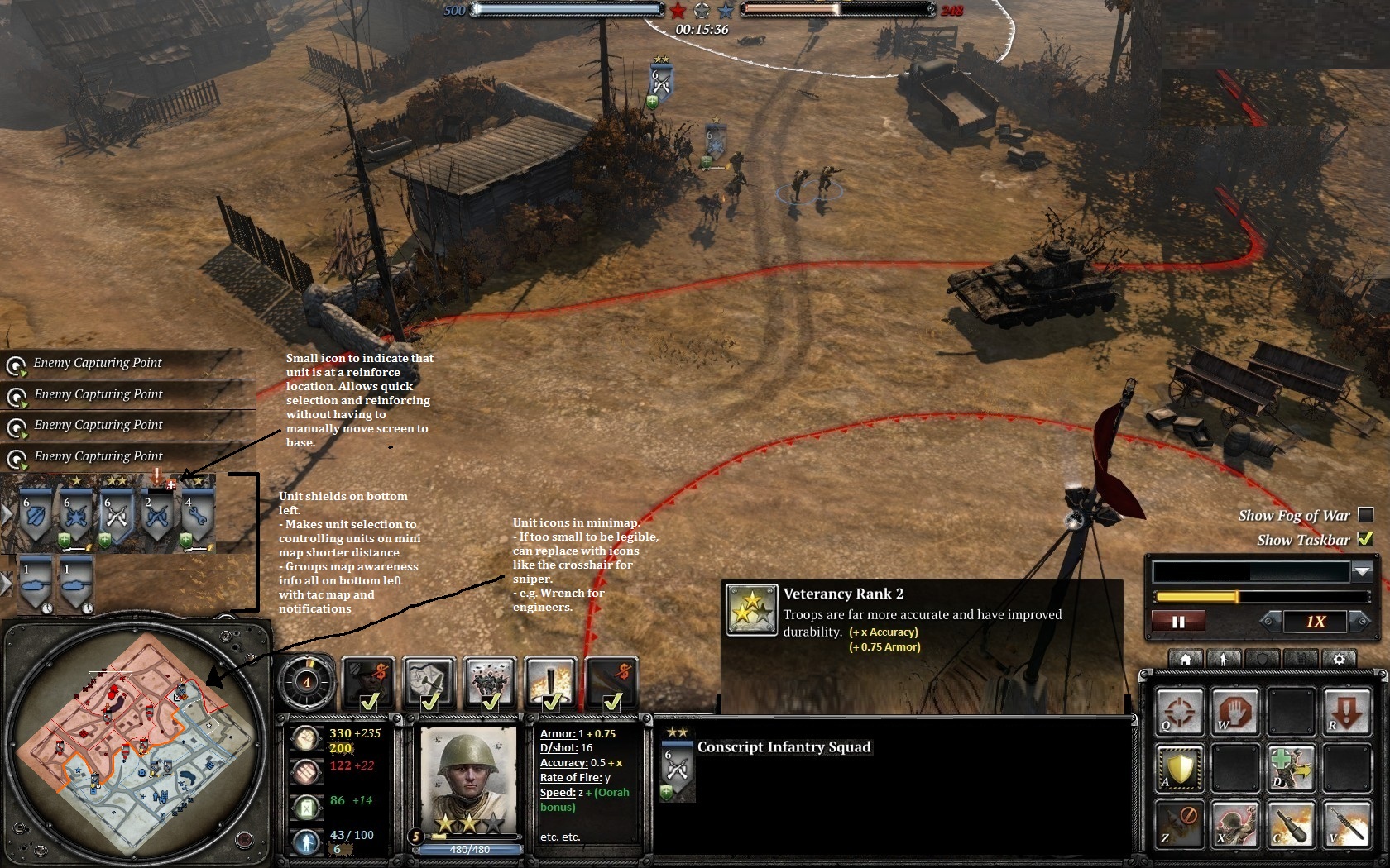
First is to group map awareness stuff together. The unit shields, notifications, and mini-map are now all on the lower left so that you don't have to alternate between top right and bottom left to get unit position and unit status info. Yes you can just open up the tac map, but this gives almost the same amount of awareness without being taken away from microing your troops.
Also, the distance from selecting a unit from their shield icon to controlling them on the minimap is greatly reduced, making it a bit faster and easier to do, especially for those that don't use hotkeys much.
Some other small changes are "reinforceable" status icon near unit shields so you know which troops you can reinforce while your screen is away from them and using unit icon/shields on the mini-map just to give a bit more info.
Bottom:
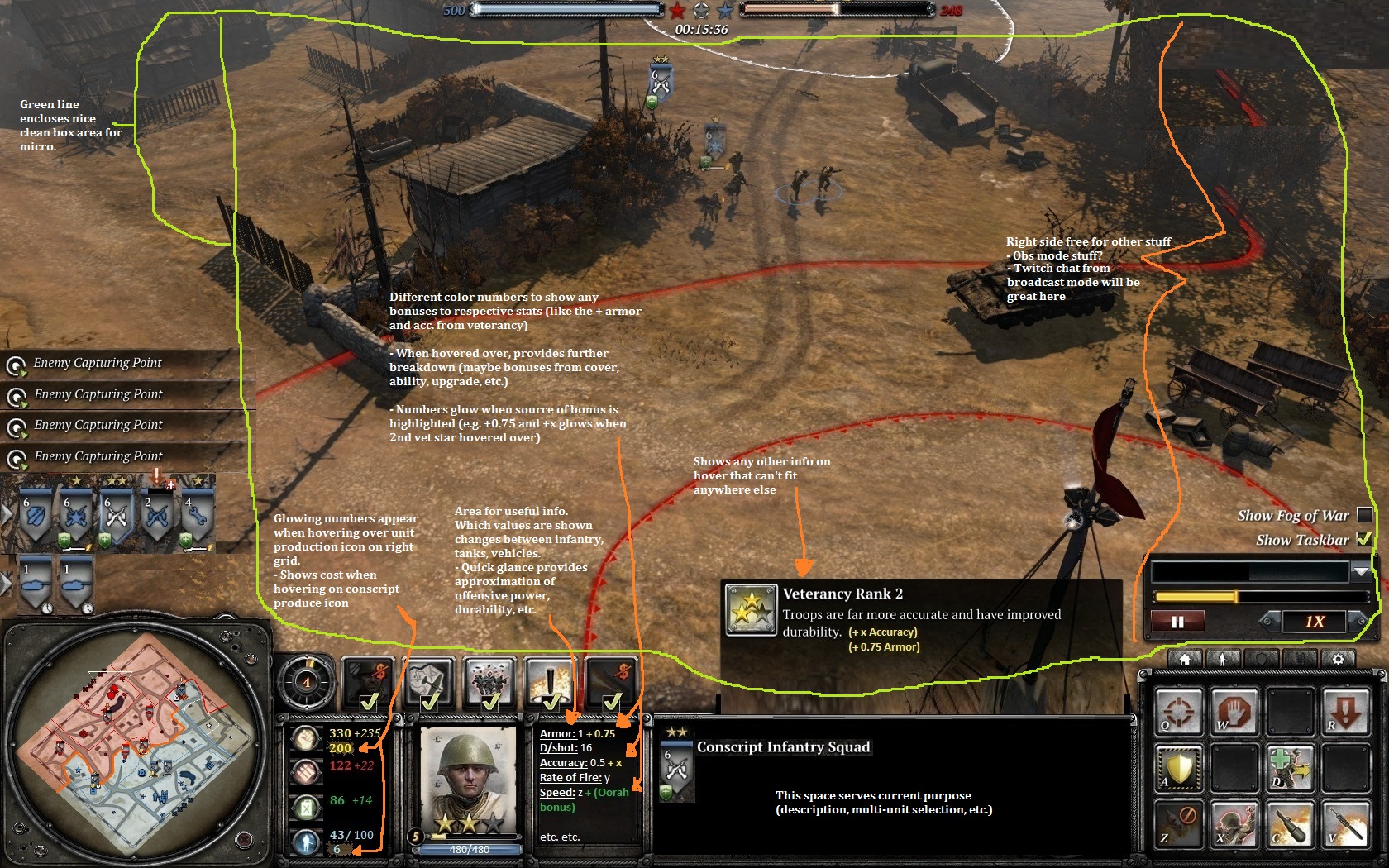
Resources are now on bottom left and vertical again. This is just to localize the useful info to the lower left, and I find it much easier to view a vertical list. Any unit costs that usually appear above the horizontal bar can now appear as glowing numbers by the actual resource numbers.
A somewhat big change is the "stats box" to right of the unit portrait. I'd like a box there containing some important unit stats so we can get an idea of how capable a unit is. By looking there and comparing unit stats, we can get an idea of how a match up can play out.
Added benefit is that we know more about upgrades/vet and how much stronger a unit becomes with them. Numbers on the health bar is just an extra touch, but could be important to show unit durability together with armor stat in the box.
Transparent hover box area can stay there to provide additional info when mouse is hovering over something.
Green line just there to show that the playing area becomes a nice clean box. Relevant information is grouped on the bottom left and middle. Bottom right still remains as that selection grid.
These changes make the UI (personally) a bit more usable and much more informative.
Thoughts?
(I don't know how to make the images clickable, but just right click -> view image to view a larger version for those who didn't know. Each image has a bit more explanation.)
Bottom left side:
First is to group map awareness stuff together. The unit shields, notifications, and mini-map are now all on the lower left so that you don't have to alternate between top right and bottom left to get unit position and unit status info. Yes you can just open up the tac map, but this gives almost the same amount of awareness without being taken away from microing your troops.
Also, the distance from selecting a unit from their shield icon to controlling them on the minimap is greatly reduced, making it a bit faster and easier to do, especially for those that don't use hotkeys much.
Some other small changes are "reinforceable" status icon near unit shields so you know which troops you can reinforce while your screen is away from them and using unit icon/shields on the mini-map just to give a bit more info.
Bottom:
Resources are now on bottom left and vertical again. This is just to localize the useful info to the lower left, and I find it much easier to view a vertical list. Any unit costs that usually appear above the horizontal bar can now appear as glowing numbers by the actual resource numbers.
A somewhat big change is the "stats box" to right of the unit portrait. I'd like a box there containing some important unit stats so we can get an idea of how capable a unit is. By looking there and comparing unit stats, we can get an idea of how a match up can play out.
Added benefit is that we know more about upgrades/vet and how much stronger a unit becomes with them. Numbers on the health bar is just an extra touch, but could be important to show unit durability together with armor stat in the box.
Transparent hover box area can stay there to provide additional info when mouse is hovering over something.
Green line just there to show that the playing area becomes a nice clean box. Relevant information is grouped on the bottom left and middle. Bottom right still remains as that selection grid.
These changes make the UI (personally) a bit more usable and much more informative.
Thoughts?
11 Aug 2013, 09:03 AM
#48
 2
2 
Posts: 2181
Those shields are so much better at the place you put them 
Much easier to glance over.
I don't know how I feel about the stats screen, there are too many variables to just say what the stats of one unit are at any given time. How is the RoF gonna change when they pick up a lmg and shreck?
____
One small UI change I would change myself is to switch the icon if units inside buildings from the left top to the right one. This makes it easier to see if any unit is lowhealth since the garrisoned icon will currently block it
11 Aug 2013, 09:26 AM
#49
Posts: 83
it's an interesting UI indeed, but sadly this is a lost fight from the alpha/beta. Relic was told since day 1 this UI is just inferior to coh1's UI, but they still think it's awesome for some crazy reason.

11 Aug 2013, 09:41 AM
#50
Posts: 8
@Sarantini
Glad you agree! Saw it in Tycho's UI suggestion and thought that was pretty good.
Yeah, I thought of that and put it up anyway since it's just to demonstrate an idea. Which exact stats to put up will have to be decided later but I just wanted to suggest that defensive and offensive capabilities should be quantified somehow. For tanks it works a bit better:
Health + Armor -> durability. Might also indicate which tanks are effective/ineffective against them depending on...
Penetration + D/Shot -> AT effectiveness
Splash -> AI effectiveness
Rate of Fire -> good for tanks since their cannons should stay the same
(though I don't know how it'll work for KV-8s and MG upgrades)
Speed -> might not be necessary, but good to know. Maybe to check if you can chase something down?
I also like that building icon suggestion. I notice it more now that you've mentioned it. It's a small thing but can really make the difference when things get hectic. Also works well with the suggested reinforce icon since, if it's now in the upper left, those units are probably in relative safety anyway.
@MW.(YrU$
Thanks! Yeah, I made this post knowing that they probably won't work on it, especially since the current UI is usable and they got a lot of other things to work on. But I thought I'd put it out there anyway. Hey, it might even give Relic an idea or two somewhere down the line.
1 user is browsing this thread:
1 guest
Livestreams
 |
|
|
27 | ||
 |
|
|
9 | ||
 |
|
|
12 | ||
 |
|
|
1 |
Ladders Top 10


-
#Steam AliasWL%Streak
- 1.1452788.648+15
- 2.579354.621+14
- 3.1150404.740+22
- 4.48870.875+12
- 5.579376.606+13
- 6.24061.797-1
- 7.388202.658-1
- 8.645263.710+2
- 9.351124.739+5
- 10.435309.585-1
Data provided by
 Relic Entertainment
Replay highlight
VS
-
 cblanco ★
 -
 보드카 중대
-
 VonManteuffel
 -
 Heartless Jäger

Einhoven Country


Honor it
18
Download
3345
Board Info
949 users are online:
949 guests
0 post in the last 24h
6 posts in the last week
16 posts in the last month
6 posts in the last week
16 posts in the last month
Registered members: 72101
Welcome our newest member, jl9casino
Most online: 4501 users on 26 Oct 2025, 01:00 AM
Welcome our newest member, jl9casino
Most online: 4501 users on 26 Oct 2025, 01:00 AM