(CoH shot for comparison)
CoH had all the important stuff on the left. Minimap, CP progress, resources, unit stats, notifications, and so on. The stuff on the right was just hotkeys that everyone memorized, the stuff in the middle was a summary of what you had selected (which is useful but also onscreen if you are looking at your units), and the stuff at the top was just VPs which are easy to glance at. The only exception was control groups, which went on the right, but those weren't helpful at all so it didn't matter.
CoH 2 moves CP/doctrine info to the right, resources to the middle right, and although it actually makes the control group/unit display useful, it moves it to the top right. We don't know where notifications come in, I guess. So now to see the same information that you'd get in CoH by glancing in the bottom left, you have to glance at the bottom left and the bottom middle right.
The top VP monitor, the CP count, the doctrine ability display, the unit information, the minimap, the pop cap, and the resource display are also more complicated than in CoH.
A good example is the little CP circle. In CoH it's a plain button with a bright green ring around it and a big number in the center. In CoH 2, there's an ornate metal border around it, a ton of little metal notches in the ring, and the number in the center is much smaller. Why make it more complicated looking? What is wrong with something that is simple and easy to read?
In the original CoH, unlocked doctrine choices were simple buttons and locked doctrine choices didn't appear. In CoH 2 when you unlock something it has a bright green checkmark and if something is locked it has a red circle with a line through it. Apparently also grayed out means something different in CoH 2 (although notice that the graying out that CoH 2 does seems a lot darker than CoH's graying out). I guess it's good to see all the doctrine choices (since now we don't have a choice?) but the MASSIVE metal borders around all of them plus the checkmark for the unlocked ones just makes that whole side of the screen very busy.
Busy seems to be the watchword for CoH 2's interface, really. Metal borders around stuff and metal rivets on those borders have been added all over, along with scratches, dirt, and so on for the bottom UI. The original CoH wasn't perfectly clean but it was much less complicated looking, and had much less contrast. The tan/olive/brown of the original CoH pops out much less than the metal blacks whites and grays of CoH 2.
Even little things like adding a VP bar at the top for each team adds to the clutter and business. I also personally find the green on the minimap harder to see than CoH's blue, which is important for recognizing cutoffs.
Things I like about the new UI: the unit list, which I already mentioned, is great (although the high contrast white on the unit shields makes them much harder to look at than the original CoH unit shields and I'm having trouble figuring out which little icons at the bottom go with which shield - they should probably overlap more or be redesigned to fit into the shield). I like the new colors for the resources - they were all basically the same in CoH.
First look: Company of Heroes 2 in-game UI
7 Jan 2013, 19:08 PM
#42

Posts: 1620 | Subs: 2

Signature by Ginnungagap
7 Jan 2013, 20:11 PM
#43

Posts: 93
I share all the sentiments brought up here. For me, it boils down to: If it ain't broke, don't fix it!
Greets
Schepp himself
Greets
Schepp himself
7 Jan 2013, 22:24 PM
#44
Posts: 119
(CoH shot for comparison)
Why make it more complicated looking? What is wrong with something that is simple and easy to read?
Well said! I too find the UI too busy and hard to read. I hope they add a classic UI. I'm not comfortable with the new one. Though I like the font , the information is too cluttered by bright and contrasting backgrounds.
I fear though that the UI wont change because they made a special announcement: "See here, this is the UI." Changing or even reverting things to the old UI might not be possible past this point. I hope they listen and accept change for the better (colorblind-mode *cough*).
8 Jan 2013, 00:42 AM
#45

Posts: 881
After 100+ games, I'm sure we'll not even notice it anymore.. and complain if they change it back MVGame
8 Jan 2013, 00:57 AM
#46
Posts: 28
Ugh, looks nowhere near as good as vCOH. Disappointing for a game 7 years older.
Looks almost ugly. Major gripes: Looks almost cartoony in the display of icons on the display, the symbols for each unit are way too faded. Something that can be easily fixed, but even I would have a bit of difficulty detirmining where my soldiers are, and where the enemy soldiers are.
Also, could they have made the resources any more difficult to look at?
Any news on resource points? I can't believe they have made it so that you can just build on any point to make it a fuel or muni point. What a brilliant way to completely remove the strategy of fighting for resources. Now all everyone will do is rush the first three points on each side, build on them, sit back and build up their army. Very disappointing.
8 Jan 2013, 01:09 AM
#47


Posts: 783 | Subs: 3
UI is hideous. Ami basically said everything I would have. The art guys need to sit down and ponder the phrase "less is more" for a few days on a silent retreat in the mountains or something.
The resource change is ridiculous too. Having resources being in the middle and sides of the map meant there was something worth fighting for in places besides the VP. Now it's going to be one long battle over the middle VP.
The whole thing reeks of a desperate attempt to create something new. I don't know why the devs feel the need to do so when they are making a sequel. The way resources worked in CoH was excellent, the only issue was the manpower income for the various factions. What the change also does besides make the map less dynamic is prevent different maps from playing differently. If you can build 2 fuels and an ammo on every map, the strategies will be much less map dependent; obviously terrain will matter, but for example:
On langres the US player can hold 2 of three +10 fuels, one of which can be connected even if US player loses his cutoff. On semois you'll usually only have a single +10, and a heavily contested +5. This leads to things like bars ---> tank depot being done more often on langres, while semois sees a fuel op and nades --> wsc and then either MP or TD.
That idiot thought he won. In fact, he was wrong. Completely mistaken.No M3 he what things are not,just one moron.
The German oil scarcity, rare tanks cannot fight the Allied torrent. Kill the house to kill the German oil.
Every time lose may feel bad. Probably not the word lose your subconscious. Maybe I win you Not for the first time Maybe you you should go to recall,
The German oil scarcity, rare tanks cannot fight the Allied torrent. Kill the house to kill the German oil.
Every time lose may feel bad. Probably not the word lose your subconscious. Maybe I win you Not for the first time Maybe you you should go to recall,
8 Jan 2013, 01:29 AM
#48
 15
15 
Posts: 1708 | Subs: 2
without breaking the NDA I wouldn't get too worked up about the resource system.
8 Jan 2013, 02:00 AM
#49
Posts: 28
without breaking the NDA I wouldn't get too worked up about the resource system.
hehe I am judging my opinion on what I've heard from others, so it might have been changed. Hopefully.
8 Jan 2013, 14:46 PM
#50

Posts: 31
'
- Red and Blue was win and has become iconic for Company of Heroes, why fuck with it?
Honestly I wouldn't say that it's iconic for CoH, look at Team Fortress 2 and Halo, and they're R&B
But I get your point. I wouldn't want any of my units to be camouflaged in the trees because they're green too.
Comparing the CoH2 ui with the vCoH ui, the VP bar looks better in the vCoH ui. It was really clear and that white huge font was screaming "cap the vp! cap the vp!" Now we have 2 bars and it's hard to decide which one to look at. (I'd rather keep the numbers, sometimes bars may look equal but in fact you're losing)
The timer there could be a really nice addition, but I fear that it's going to be distracting. I'm not sure why, but I feel it has something to do with concentrating on the action and not your bed-time (I know it's a stop-watch, but things like "omg its 1 hour" kinda kill the moment of the game seeming to last longer)
I actually like the ability icons for CoH2. With the hotkey there, it's much easier for my free left hand to select the ability while my right hand homes onto the target. I also like the change in style; new style, new place.
The minimap for CoH2 looks like a child drew it (ok, it may be a bit of an exaggeration). In vCoH it looks like a recon plane flew over it, took a picture, then commanders outlined the territory sectors. Speaking about sectors, the really huge ones in the CoH2 minimap look way too huge.
The commander abilities look awkward in CoH2, if they were unlocked CoHO-esque why not just put them where they were in CoH? For me, it looks "closer to home". But honestly I'll have to play with the abilities there first to say anything more.
About the ping buttons, is that the only one there? (Near mini-map, bottom right). I still wish there were 3 ping icons. It used to be a code, without having to type out what you really mean. Like Red: I'm artying here, stay clear. Yellow: Enemy spotted around here, and White: Move there please
I have mixed feelings about the resource bar. Since it freed up some space for the bridge (which feels much more comfortable for me when i visualize the text gone), it could work. And just how I read left to right, I read up to down too. And the Manpower-Munition-Fuel order is practically ingrained in me right now. So it could work. My other feelings is that too. I could make a quick comparison by just swiping my eyes towards the bars and I can easily see all of their values, one on top of the other. Here, I have to look across.
This is all I'll say now. Got stuff to do.
8 Jan 2013, 17:48 PM
#51

Posts: 48
Red and Blue was win and has become iconic for Company of Heroes, why fuck with it?
I must be the only one pleased by the colours chosen.
Red and Green are also iconic colours; for Red Army and Wehrmacht. I hope they keep it and bond them to the army, no more friendly/foe colour switch.
And of course I'm totally for a classic Red/Blue option for the unlucky colours blinds.
8 Jan 2013, 17:54 PM
#52
Posts: 1620 | Subs: 2
In the article it's clear that green is you and red is enemies, because green is the Red Army here and red is the Wehrmacht. Even if they went for red and green because those colors represent the armies historically (because fuck you colorblind people), the sickly lime green and bright tomato red they chose aren't as pleasant to look at as the muted blue and red that Company of Heroes used.
Signature by Ginnungagap
8 Jan 2013, 18:05 PM
#53
Posts: 48
Arf. Fighting for the comrad Stalin versus Red icons army is impossibru.
9 Jan 2013, 09:58 AM
#54
Posts: 28
Green looks horrible on both factions.
10 Jan 2013, 00:30 AM
#55
 5
5 Posts: 16697 | Subs: 12
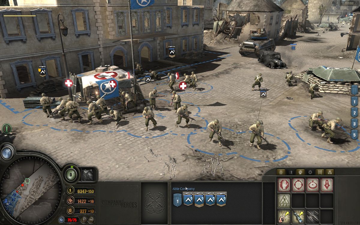
New screenshot:
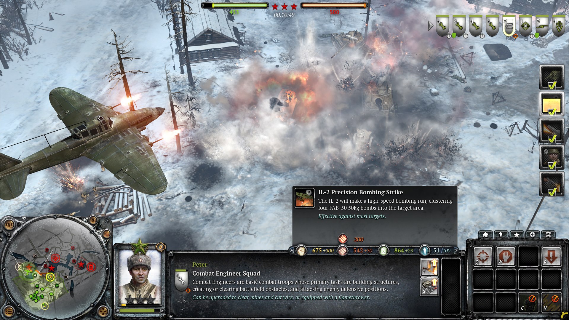
Nice to see the UI in full HD resolution.

Nice to see the UI in full HD resolution.
10 Jan 2013, 00:39 AM
#56
Posts: 881
I don't understand that picture.. how can the grenadier squad be in his army, when he have soviet call-ins and a soviet Combat Engineer Squad selected? Or am I just tired? 
10 Jan 2013, 00:42 AM
#57
5 Posts: 16697 | Subs: 12
I don't understand that picture.. how can the grenadier squad be in his army, when he have soviet call-ins and a soviet Combat Engineer Squad selected? Or am I just tired?
I think it's a good catch! Photoshop ftl
10 Jan 2013, 04:17 AM
#58
Posts: 1620 | Subs: 2
It also seems like the unit display on the upper right shows more units than are on the minimap in the bottom left. Photoshop indeed! And the combat engineers selected in the main UI in the middle don't show up in the upper right (look at their health).
edit: actually it looks like maybe the plane has a squad under it in the screenshot, so they could be the missing squad on the minimap. Still doesn't explain the grenadiers and the engineers.
edit: actually it looks like maybe the plane has a squad under it in the screenshot, so they could be the missing squad on the minimap. Still doesn't explain the grenadiers and the engineers.
Signature by Ginnungagap
10 Jan 2013, 09:21 AM
#59
Posts: 881
In the upper right he has a MG-squad selected..
10 Jan 2013, 11:36 AM
#60
 1
1 
Posts: 4559 | Subs: 2
We just found out that the Maxim MG has 2 abilities ") One of them seems to be the incendiary munitions (like the MG42), the other one seems to be new.
One of them seems to be the incendiary munitions (like the MG42), the other one seems to be new.
One of them seems to be the incendiary munitions (like the MG42), the other one seems to be new.Playercard of Marcus2389 | ||||||||||||||||||||
|


10 Jan 2013, 12:00 PM
#61
Posts: 881
I actually think it's the MG42 abilites we're seeing, as the icons in the upper right, where he's selected the MG-squad, are german.
1 user is browsing this thread:
1 guest
Livestreams
 |
|
|
61 | ||
 |
|
|
1 | ||
 |
|
|
2 | ||
|
|
|
|
2 | ||
 |
|
|
2 | ||
 |
|
|
1 |
Ladders Top 10

-
#Steam AliasWL%Streak
- 1.968562.633+23
- 2.555227.710+11
- 3.29446.865-1
- 4.275110.714+13
- 5.259143.644+3
- 6.250150.625+11
- 7.22491.711+11
- 8.19265.747+5
- 9.670423.613+6
- 10.5611.836+3
Data provided by
 Relic Entertainment
Replay highlight
VS
-
 cblanco ★
 -
 보드카 중대
-
 VonManteuffel
 -
 Heartless Jäger

Einhoven Country


Honor it
7
Download
742
Board Info
410 users are online:
410 guests
0 post in the last 24h
17 posts in the last week
133 posts in the last month
17 posts in the last week
133 posts in the last month
Registered members: 45007
Welcome our newest member, jayehicks
Most online: 2043 users on 29 Oct 2023, 01:04 AM
Welcome our newest member, jayehicks
Most online: 2043 users on 29 Oct 2023, 01:04 AM